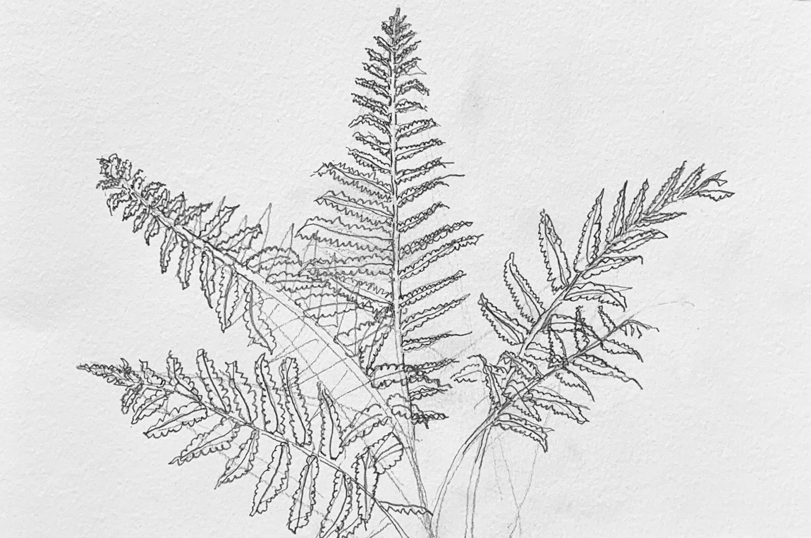
We started our new term, after a lengthy break, with an exercise to help us recall some key basic skills that we will need for the term: how to see shape, how to use line, finding pattern, developing edges, varying line weights (i.e. hand pressure to draw thin, light/thick, dark lines) and simple, quick, accurate ways to measure check basic proportions. The beautiful plant group of ferns is giving us the inspiration to do this. Here are the first stage drawings from today. Watch again the short video, opposite, on the elements of line. This will help to reinforce your understanding of the concept of line and shape.
 |
| Anne: very well observed. Good proportions. Vary line weights further to increase spatial quality, this will add sense of depth and interest to the lines. This is especially important on the edges and the finer details within the leaves. |
 |
| Brian: well observed with clear understanding of main contour (outline) of shape. Perhaps use a sharper pencil as this will help you to echo the fine lines in this feather. |
 |
| Brian: good use of consistent line weight to emphasise style/shape rather than form (depth). |
 |
| Carolyn: well observed shape and proportion with good awareness of angles. Use heavier lines for parts of the plant that are nearest to the viewer and lighter weights for edges and shapes that are more towards the background. Use soft pencil (e.g. 2B up to 4B) with a sharp point to give you greater control of the line weights. |
 |
| David: good use of the whole sheet/frame. Well observed big shape of the whole plant within the frame (design). Nice variation of line weight on the edges (contours) of the leaves. Take this further by making the edges that are closer to you darker with heavier lines (increase the pressure you use with the pencil) to contrast with the lighter lines. |
 |
| Jane: well observed shape and good proportions in the leaves. Nicely sensitive line edges (contours) showing the uniqueness of each leaf by its' signature shape. Keep drawing the rest of the plant in this way and it will be a very good drawing. |
 |
| Janice: good observation of the big shape of whole plant and good outline simplification of each leaf that will guide your drawing. Nice delicate lines for the leaves. Keep going and use a fine point (sharpened) soft pencil (e.g. 2B - 4B). |
 |
| John: very well observed proportions and very good attention to shapes especially the edges. Good sense of depth using angles and curves. Try more variation in line weight to complete this study to bring out even more the individual character of each leaf. Do this by using heavier (more pressure, thicker) lines for the nearest leaves or parts of leaves and thinner (less pressure, thinner) lines for those parts that are farther away. Use 2B to 4B pencils for greater control of weight. |
 |
| Karen: very well observed shape and proportion with good appreciation of angles and curves. Good use of line weight variation to show depth. Take this further by being a bit more careful with the lines and line weights inside the petals as you develop the study towards completion. The way the lighter first stage drawing in of the stems and the leaves contrasted with the heavier line weights of the more finished petals is a good example of how much depth you cab create using just a variation in line weight. |
 |
| Linda: excellent understanding of the big shape of the whole plant and the larger outlines of each leaf. Very good observation of the edges of individual leaflets. Use a well sharpened soft pencil (2B-4B) to add subtle changes to each leaflet by applying varying line weights. This will also help to distinguish between the larger leaf shapes. |
 |
| Margaret: well observed big shape of whole plant with a nice feeling of density and heaviness of the plant. Use a well sharpened soft pencil (2B-4B) to add subtle changes to each leaf by applying varying line weights to edges. For the shapes nearer to the foreground use a heavier line for the edges of those leaves and use a much softer thinner line for the background leaves to increase the perspective. |
 |
| Moira: well observed big shape of whole plant. Very good angles and sense of spread of the leaves. Very good angles and curves. Use a well sharpened soft pencil (2B-4B) to add subtle changes to each leaf by applying varying line weights to bring out the depth and character of the plant as you compete this study - it will be well worth the effort! |
 |
| Val: beautifully observed with very good understanding of shape. Great understanding also of form which is especially well executed using only line weight variations. To complete this study use a well sharpened soft pencil (2B-4B) to add a few further subtle changes to line weight near the stem of the feather. |