 |
| Anne |
 |
| Brian |
 |
| Christine |
 |
| David |
 |
| Janice |
 |
| Karen |
 |
| Linda |
 |
| Margaret |
 |
| Moira |
 |
| Moira |
 |
| Pat |
 |
| Pat |
|
| Anne |
|
| Brian |
|
| Christine |
|
| David |
|
| Janice |
|
| Karen |
|
| Linda |
|
| Margaret |
|
| Moira |
|
| Moira |
|
| Pat |
|
| Pat |
 |
| Anne: very strong developments today. Your tonal values are getting much more effective as you find your way to the required depth (darkness) of tone. In the final stage just keep your focus and look hard for the colours within the tones. |
 |
| Brian: you are really getting to grips with this one. Very effective and thoughtful response to the edges. Now sit back and look for the overall feel of your study and see if anything obvious asks to be tweaked (it might not!). |
 |
| Christine: a wonderful extension of the previous painting with a powerful sense of abstraction. I like the subtle introduction of rougher texture. Is there a foreground and a background area I wonder? Could this be a new mini development within this painting? |
 |
| John: excellent reworking/recovery of the background which simplifies the whole painting marvellously. Now see if you can add a couple of extra colours with really close tonal values to the trees but without losing their simplicity. |
 |
| Karen: strong progression today. The shadow on the face and the similarly dark toned colours nearby are starting to come together well. Keep looking for the extra darkness in each of the adjacent shapes as discussed in class. Make them almost the same tones as each other. |
 |
| Linda: a really worthwhile project is emerging from your initial idea. Try experimenting in this thumbnail stage with bolder colour palettes and close value palettes until you find the colour palette and light register that most appeals and feels "right" for the subject. |
 |
| Moira: this is looking much better - you are seeing more clearly how important the various elements are to each other: lines/rhythm, tone/colour, mirrored shapes and lines. Looking good even at this early stage. |
 |
| Pat: you have painted this at a good pace, quick enough to cover the white paper and to work spontaneously to find the right colours whilst having enough space to reflect and decide on each area as you go. It is looking extremely positive at this stage. Next stage is to start adding layers of colours and depth of pastel powder to get closer to the palette and effect you want. |
 |
| Anne: this is going really well. The close dark toned colours inside the large canopy are excellent. You can use this as your guide/reference for all the other tones as this is the darkest area. The whole painting needs to be dark so that there is maximum contrast with the small triangle of sunset. |
 |
| Pat: well done on your first completed project in the group, this is fantastic. Skillful technique giving rich surface textures. For your next project look for a subject that gives you the opportunity to build on the same skills, use of colour, blending to consolidate your learning. |
 |
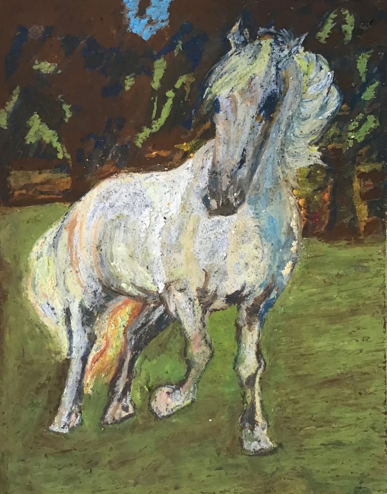
| Christine: love the palette that is emerging and the depth of colour. Think how you can further develop the treatment of "bars" on the horse's back as discussed and how you might develop a stronger palette for this area. |
 |
| David: this is a really good start. Love the colours and the blending on the horse. In the sky areas think about how you might have shapes within the blue perhaps in different shades of blues and light purples? Try to build up more layers of pastel on the paper to strengthen the colours if you can. |
 |
| Janice: wonderful close tones in a rich velvety coloured palette. Bottom right corner works so well now with its close, dark tones. Look again carefully at the white diamond on the horse's nose and see if you can find any other, subtle, colours. |
 |
| John: super treatment of the horse's flesh and colours. Continue working on the rectangular area of the grass. To make it a more unified shape make even your bright greens darker so it is becomes hard to distinguish where green shapes end and the more earthy brown shapes begin - close tones. |
 |
| Linda: excellent steady progression. It's good to see even at this stage you are controlling the tones of the colours so the contrast is kept more subtle. When all the remaining large white areas of unpainted paper are covered you will get a better measure (eye) and understanding of the overall palette (potential). |
 |
| Margaret: great to see you enjoying this challenge and having a right good go at it. Keep adding colours on top of those already there and blend them thoroughly. We will take stock when you get back. Looks like it will be another good one. |
 |
| Anne: good, simple shapes and a good ground colour layer. Very nicely drawn. Look for the darkness of tones in this one as you add the subsequent layers. |
 |
| Brian: nicely thoughtful exploration of colour and shape in the Marc painting. Agree the smooth card is making it difficult to achieve density of colour. But you are getting good results. Try the more textured paper. |
 |
| Christine: great to see you finding your feet again and so quickly. Try having a look at Francis Bacon's portraits and see how he uses form (shape and depth) and colour, it might prove interesting? |
 |
| David: Excellent thought process with the composite approach - using various sources for the different elements of your painting. Good ground colours already. Try adding the background next to remove the white then develop the colours further. |
 |
| Janice: this is very strong and the tones are beautifully deep, closely matched and rich. Look for the highlights e.g. around the nostrils and carefully see how the lines become unusual and elegant shapes in their own right. |
 |
| John: This is definitely going in a good direction. It feels strong and dynamic with the brown paper and high tonal values (whites, etc.,). Keep all shapes simple without lots of marks. Look for the colour in the horse like we did with the blue shadow and the yellow main. Use stronger colours and see what happens. |
 |
| Linda: strong start with lovely flow-lines across the surface. This is a long process because of the technique (as you have discovered) but it will produce a stunning painting and will deepen your knowledge and skills in the application of complex colour relationships on the surface. |
 |
| Margaret: this is going really well. Your shapes are beautifully simple. Good work on the grass too. Try adding a pale lilac layer blended into both the dark and light blue areas. |
 |
| Moira: stunning painting. Very well observed colours and shapes. Remember to look at your work from a good distance away and at regular intervals during the process. |
 |
| Pat: developing very nice colour and texture. Like the dark tones of all the colours - this will help you towards the end to create some really dramatic highlights. On the horse's flesh, keep the areas of different tones as simple boldly outlined shapes then blur the edges with a closely matched colour to soften them creating an undulating surface. |
 |
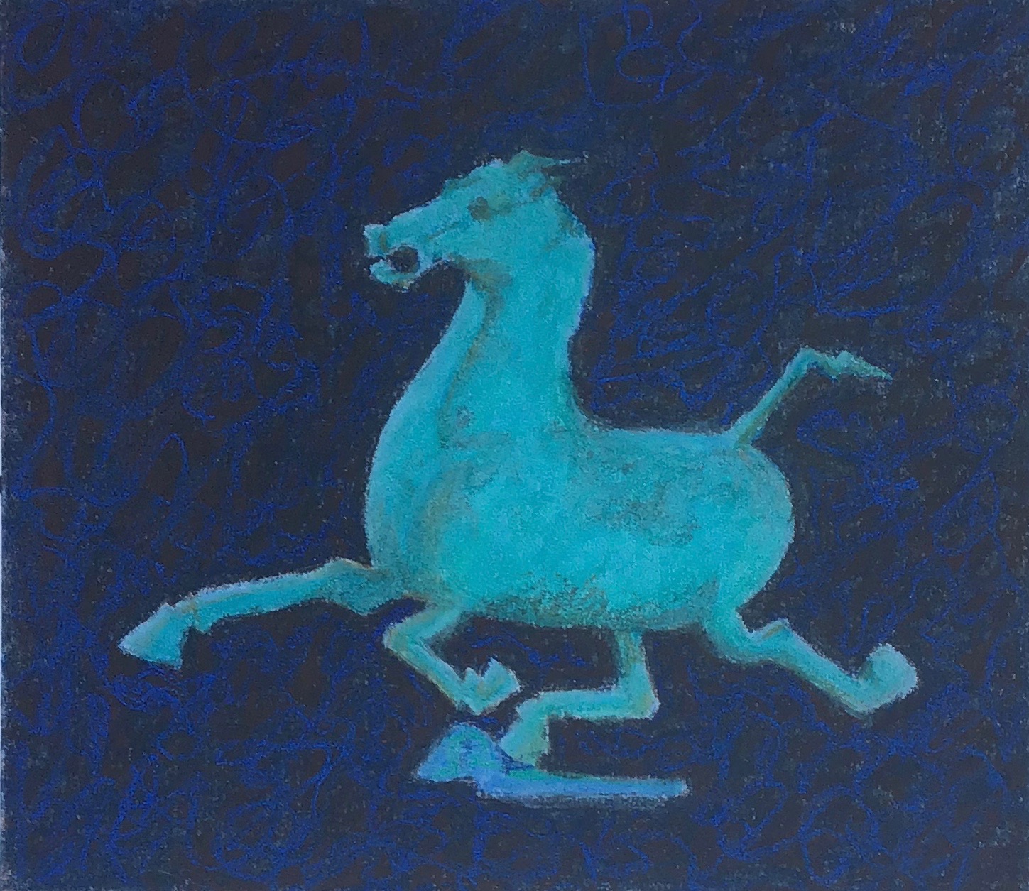
| Val: super progress and much stronger with the more simplified shapes and blending on the horse. Background colours and textures are an excellent contrast to the horse - the redness of the horse works well with the purples and greens in the background. |
 |
| Anne: excellent finishing touches around the eye. Well done. |
 |
| Anne: fascinating palette. Try to make the background colder whilst keeping it as dark as it is now - to help the mushroom colours and tones really come out. |
 |
| Brian: very good drawing style with just the right amount of information for painting. Look carefully at Marc's palette and then move quickly to get the first layer of colours across the whole image before developing the colours fully. |
 |
| Janice: beautiful technique with soft velvet tones and subtle edges. Focus on the painting and depth of pastel on the surface from now on - you've got the drawing stage in place so focus on the painting - colour, depth of pastel, contrast of tone. |
 |
| John: strong start with good response to the brown paper background helping you with the initial colour tones. The drawing stage is more or less done so move now to focus fully on the depth of pastel on the paper and the colours and tones. Keep shapes simple. |
 |
| Karen: great to see you investing so much time and energy into this painting. You are really consolidating your skills and understanding of colour, tone and contrast. Focus next on the face - not the drawing just the tone contrasts and colours. Be brave - there is darkness and drama in there. |
 |
| Linda: good to see this one in its final stage. Great contrast of styles between figure and landscape. |
 |
| Linda: very subtle and clever use of analogous colour and well tempered tonal relationships. Well finished. |
 |
| Margaret: so good to see this one finished. Clever use of cool colours and a narrow palette of blues and greens. Atmospheric. |
 |
| Margaret: good start to a tricky subject. Start work on the landscape to get colours on all the white paper areas. Then revise the colours in the horse with the help of the landscape colours you use. |
 |
| Pat: very good layering of pastel to give depth maximising the light reflecting the colours. Good blending technique but keep practising how you hold the pastel stick and how you mix fully the colours on the surface of the paper to get a fully blended layer. Move next onto the horse body by adding more varieties of reds sand browns. Mix in some orange to the horse at the end. |
 |
| Val: great progress today. Now you can focus on building up the depth of oil pastels in fully blended layers. The friction of the blending will relax the oil/wax in the sticks to help spread the colour more easily on the surface. |