Stage Two - adding colour
 |
From stage one you have the completed line drawing which has been drawn onto heavy textured watercolour paper (white).
This is now ready for the colour ground to be added, see next picture. |
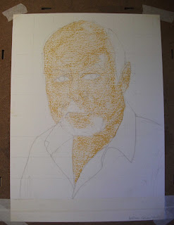 |
| The colour ground starts with the basic key foundation colour. In this example a warm yellow ochre pastel has been gently applied. Only the skin areas have been given the ground colour at this stage. |
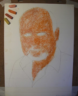 |
| Now we can start to add the effect of light to begin modelling the face by using four colours. In this way we build up the ground colours using the closely related pastels shown in the top left of the picture. |
 |
Now we introduce the more contemporary style with colour areas having hard edges and well defined shapes. More depth is created by adding the mid and dark tones, still using the warm earth yellows and reddy-browns.
In this picture the sitter has a very warm and tanned face, hence the colours used so far.
Pink has not yet been introduced to our palette. |
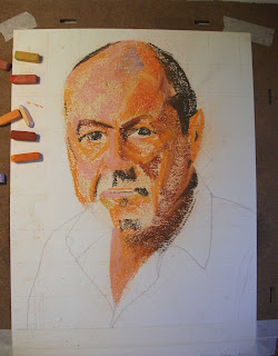 |
| We now add the strongest shadow areas by mixing a little black with the dark brown pastels then softening the se dark areas with a little white. We also add in one or two areas some new colours - lilac to the head and pinks mostly to the left hand side of the face and head. |
 |
The painting is built up further by adding more strength of tone/density of colour and emphasising the hard edges of the shapes. This final stage uses a wider range of colours as shown in the bottom of the picture. The face is "finished" firstly by further emphasising the warm reddy-brown-orange feel to the right of the face whilst the strongest highlights are added to the forehead, nose, moustache and beard.
Then we do the blue shirt using only two types of blue with lilac and white to blend the colours. The gentle folds in the shirt are done by softening the edges of the shapes with a finger. This also provides a good contrast to the treatment used on the head and face.
Lastly we add the dark background using black moderated by adding brown and blue. The surface texture is left quite rough so the paper surface texture provides our final contrast. |
 |
Here we see the same picture dealt with in two ways. On the left we see the picture has much more blending using the finger and torchon. It is also painted on a softer, less textured cartridge paper. This type of paper helps achieve the softer look. On the right we see the final version of the more modern stylistic approach, harder edged, sharper, jumpy contrasts between colours and shapes, a grainier surface feel.
The steps shown above apply equally, more or less, to both styles. In the example on the left you would see, during the various stages, defined and hard edged shapes which are then softened using the finger/torchon along the edges of those shapes to create gentler gradations of colour. |


No comments:
Post a Comment